Designing Clarity Into Michigan’s Election Results
UX Consultant @ Michigan Department of State
TIMELINE
Sep 2024 - Apr 2025
8 Months
SKILLS
Project Management
UX Research Lead
Design Strategy
TEAM
2 UX Researchers
3 UX Designers

OVERVIEW
On October 2024, Michigan Secretary of State Jocelyn Benson unveiled the state's first Voting Dashboard.


This was just weeks before the November Presidential Election. The dashboard is a Power BI tool that allowed the public to see early, mail-in, and Election Day votes in real time. Built by the Center for Civic Design (CCD), it was a first-of-its-kind civic dashboard. Following the press release, my team worked directly with Deputy Chief of Staff Neil Tambe to expand this experience to cover Michigan's historical election results dating back to 1998.
I led the Project Management and User Research building sprints and internal deadlines, running weekly client meetings, and driving the research process. Throughout, my team used AI as a working tool from ChatGPT to pressure-test our research synthesis to UX Pilot to accelerate early design ideation.
PROBLEM SPACE
Government websites are often rich in data but notoriously difficult to navigate.
In an era of election misinformation, official data sources need to do more than provide data, they need to convey election information clearly and in context. Michigan's existing historical election results website returns each election as one long, static page of tables. Finding a specific race means scrolling through hundreds of lines with little support for finding or interpreting information.
There is no easy navigation. No visualizations. No context for what the numbers mean.
Guiding Principles
Improve Usability:
Make the dashboard easier to navigate and understand.
Increase Public Trust:
Present election data clearly and in context to reduce confusion.
Design For Scale:
Build scalability into Power BI to support past and future elections.
Accountability Checks
Client Alignment:
Weekly meetings with the Chief of Staff Neil Tambe ensured decisions aligned with what MDOS could publicly support and defend.
Faculty Critique:
Stand-ups with academic advisors and peers challenged assumptions and surfaced blind spots early before they became design choices.
Neutrality by Design:
Decisions was evaluated through a nonpartisan lens to avoid biased framing or visual treatment that could favor a candidate or party.

Jocelyn Benson,
Secretary of State
“
Making those official sources of information more user-friendly, more accessible, and easier to understand makes them more useful. It prebunks misinformation and builds trust in our elections.
”

HARDEST TASK
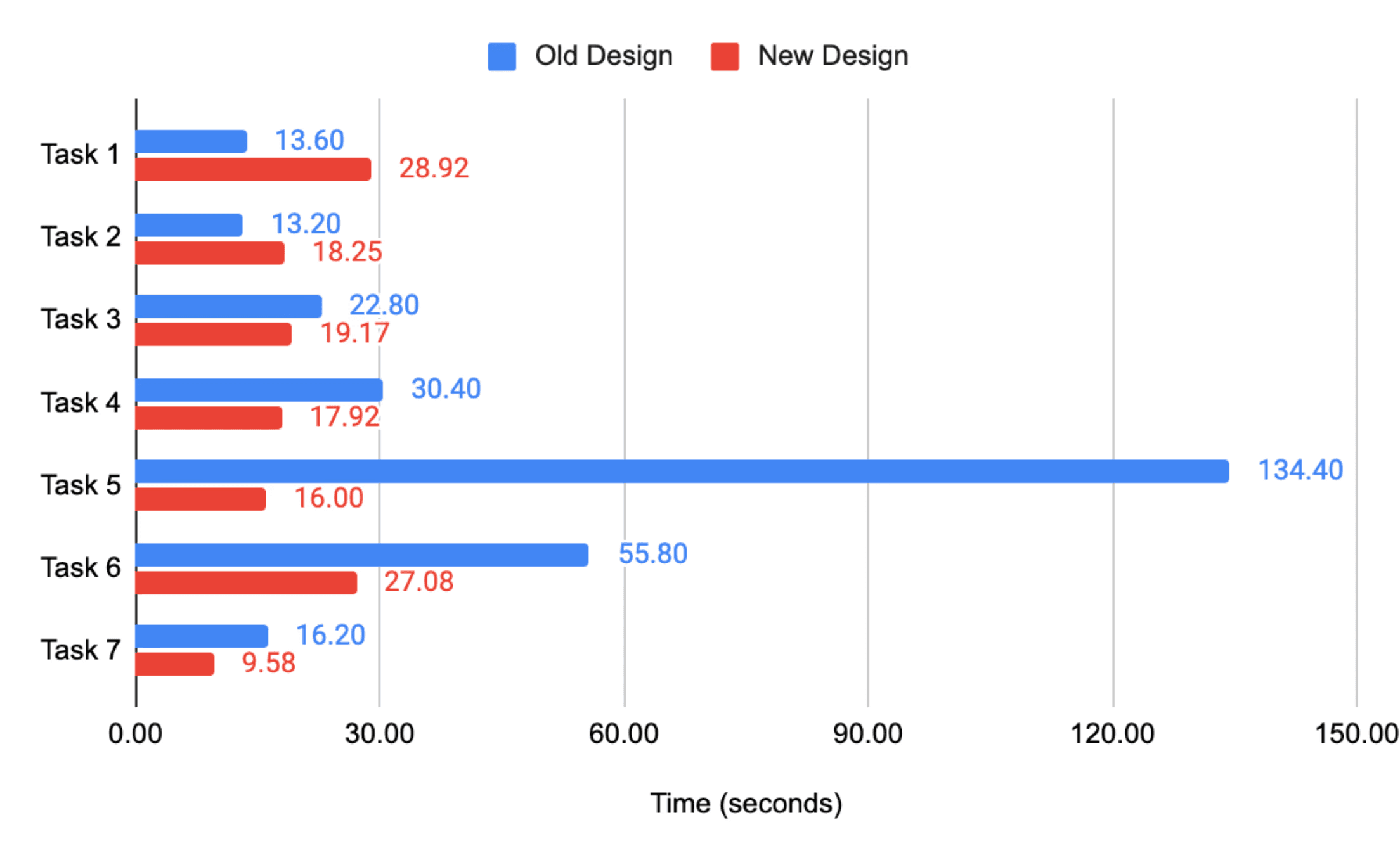
134s
16s
seconds of time reduced in locating granular precinct-level results
52%
reduction in average time it takes to complete key tasks
PERCEIVED DIFFICULTY
43%
reduction in likert scale (1-5) task difficulty across all tasks
MICHIGAN RESIDENTS
7.3+ Million
active registered voters the dashboard is designed to serve
KEY INTERACTIONS
The dashboard is centered around key interactions that target specific pain points our research has uncovered.




Misinformation Prebunking
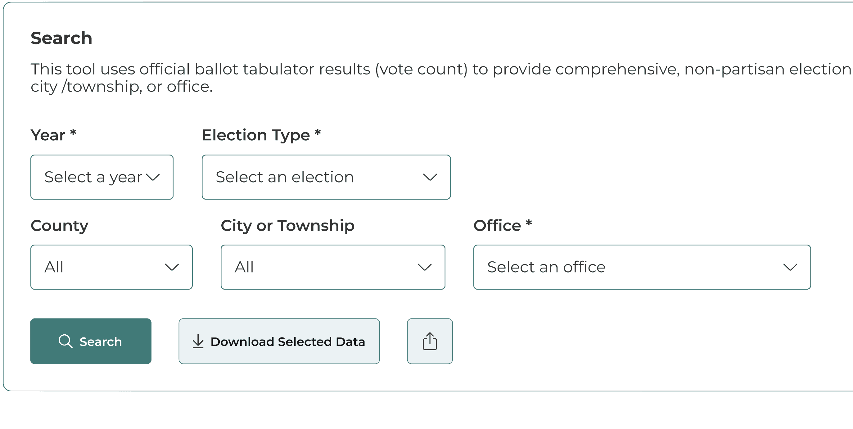
People often arrive at the site with preconceived notions and can easily become confused with the amount of data. Numbers that looked unusual without context became easy to misread deliberately. That reframed prebunking from a nice-to-have to a core feature.

Original Design
Initial Design Iteration
We played around with where to include additional context on the page without overwhelming the design. Our first iteration included a Q&A section at the bottom.


Initial Design
Why We Kept Going
Testing showed users scrolled to the additional information after they had already interpreted the data. The context needed to arrive with the numbers, not behind them.
Final Design
Contextual anchors are built directly into each section of data with info icons. They invite users to click and open pop-up cards that explain exactly what the data means before they have to infer on their own.


Election Certification Process


Ballot Tabulator Totals

Voting & Recount Procedures

Cascading Search
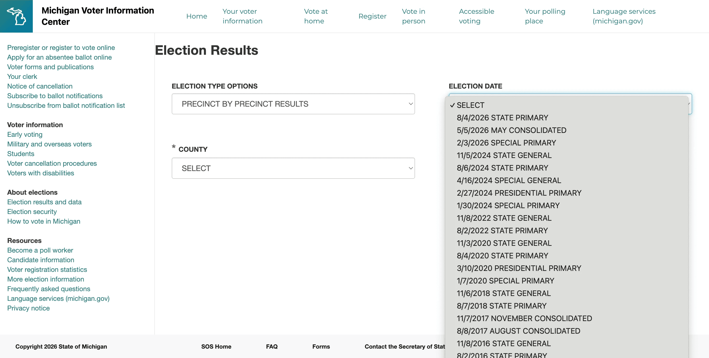
The original site had a very confusing navigation system with numerous nested dropdown menus. Our first instinct was a standard global search bar, but usability testing revealed that voters, clerks, and journalists were asking fundamentally different questions of the same data. A single search couldn't serve all groups without overwhelming each one.
Original Design
Initial Design Iteration
My team tried the simpler three drop down filter approach of Election Year → Race → Jurisdiction. This is easier to implement in Power BI than the search bar.

Initial Dropdown Search
Why We Kept Going
The filter selections were too limiting and made it harder to navigate to granular data. Users kept selecting filters in different orders and hitting dead ends when combinations didn't exist.
Final Design
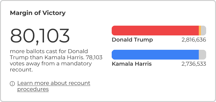
Five cascading filters that guided the search from Year → Election Type → County → City/Township → Office. Each dropdown updates based on the previous selection, so users can't select an invalid combination. Cascading filters replaced open ended search with a structured path that Power BI could support natively.


Final Navigation Bar

Data Sharing & Exportation
The original site had a single download link that dumped every race in an election into one massive TXT file from presidential down to school board. The data would have to be scraped line by line. Users needed a better way to access and share election data.

Original Design
Initial Design Iteration
We built a clear download button that lets users access the data in CSV, Excel, and JSON formats. The original TXT format isn't built for structured data and made even basic analysis painful. The new formats let users import, filter, and analyze results in their existing workflows.

Initial Data Download Section
Why We Kept Going
The format options worked, but only served a small subset of users who knew what to do with raw data. Other stakeholders wanted to share what they were seeing, not just download it.
Final Design
Our final design added two buttons alongside the search. A download option for raw data (CSV, Excel, JSON) and a share option that captures the filtered view as a link, PNG, JPEG, or PDF complete with a scope preview so users see exactly what they're sharing before it leaves the page.

Final Download Section

Final Share Section
1. Competitive Analysis
We researched dashboards across sectors to see what we could learn. Government dashboards tended to prioritize completeness over usability. Private and academic dashboards prioritized visual clarity but lacked the depth of official records. These examples helped identify expectations for search, filtering, data visualization, and contextual guidance to improve Michigan's experience.

2. Stakeholder Interviews
I led the user interviews across four key stakeholder groups to understand how each interacts with official election information. Using semi-structured interviews and user journey maps, my team identified the core needs of voters, reporters, clerks, and elected officials. Although their goals differed, every group shared one need: quickly finding trustworthy election results and understanding what the data meant.
🗳️
Voters
🧑💼
Clerks
📰
Reporters
👔
Elected Officials
3. Usability Testing
To understand where the current dashboard breaks down, we asked 15 individuals to complete seven tasks that mirror real workflows. Users felt lost in unclear navigation, struggled with confusing labels, missed critical context, and some even accidentally downloaded data they didn't mean to. The most difficult task of finding precinct-level historical results took an average of 134 seconds with one participant giving up entirely.
"Download options in TXT or Excel for each county are essential. Having access to raw data is really important, and the ability to aggregate it for analysis would make the process much easier."
"People don’t understand that unofficial data is unofficial for a reason. Clear messaging about when counts are final would go a long way in building trust"
"Navigating the website is difficult [it] leads to Voter Information, then Michigan Voter Info Center, and then a different election results page. The way the sites are nested makes it hard to navigate."
"It’s important to provide context with data visualizations…maps and charts can mislead people if they don’t explain what’s behind the numbers."
SYNTHESIS
Concluding our user research, my team synthesized findings to move from raw research to design priorities.
My team translated hours of interviews and usability testing into concrete design priorities we could defend to the client. We used affinity mapping to cluster raw data, then conducted a thematic analysis to identify underlying themes.
To pressure test the themes we have identified, we ran a ChatGPT assisted pass to check whether we have missed a pattern or overweighted one. It confirmed four of our five clusters and helped us sharpen on the fifth. From there, we used a priority-vs-feasibility matrix to decide which features to move forward with.
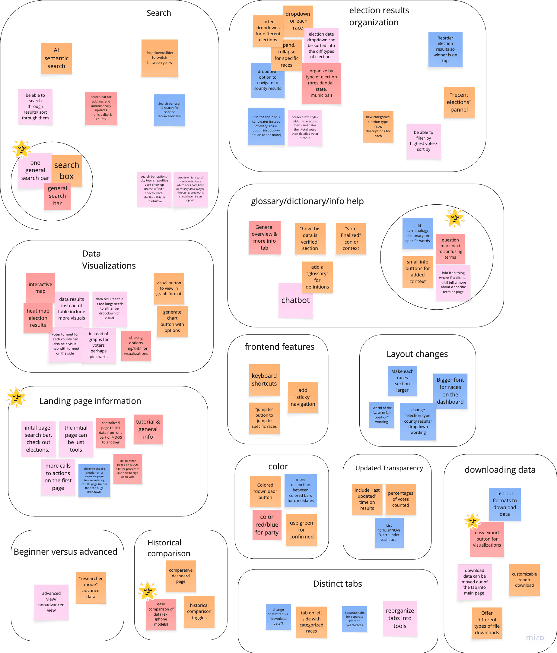


Click to Zoom
DESIGN SYSTEM
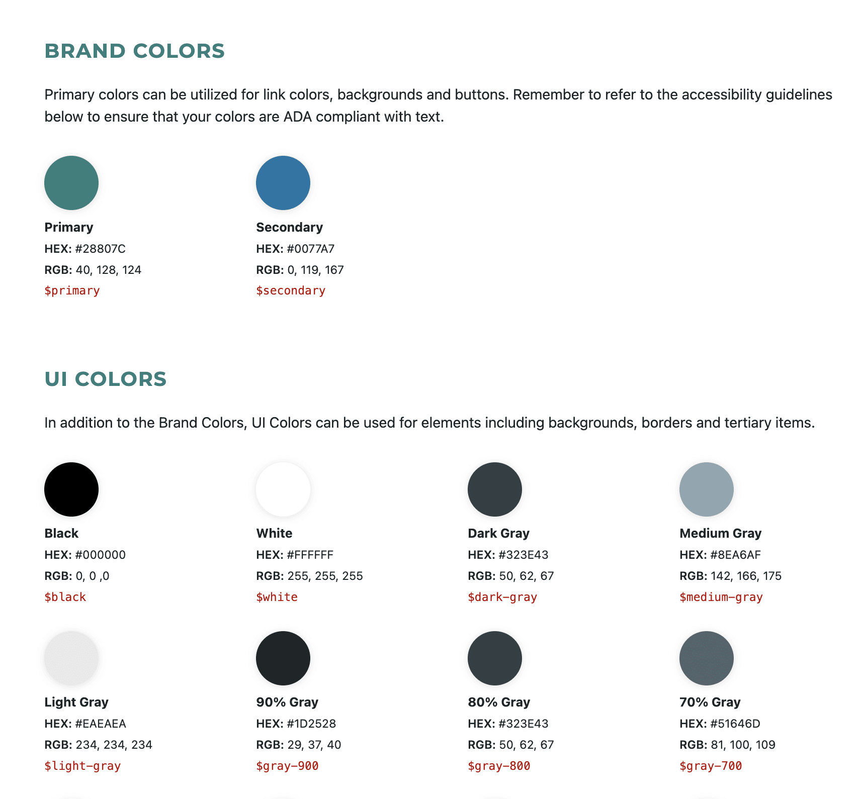
Rather than invent a new visual language, we built upon established design systems and documentation.
We inherited from the Center for Civic Design and Michigan's Digital Guidelines. These established tokens and components are already trusted by government stakeholders and built to work within Power BI constraints. Every new component was tested to WCAG 2.1 AA standards using WAVE and axe DevTools. This ensures the design held up to accessibility standards as rigorously as it held up to institutional ones.

IMPLEMENTATION & HANDOFF
With real world deployment in mind, we had a cross-functional workflow to implement the final deliverable in Power BI.
We designed from wireframes through high-fidelity prototypes in Figma, then produced a style guide and handoff documentation to translate that work into Power BI implementation. Before committing to any interaction that depended on the platform, I attended a Power BI Workshop to understand what it could and could not do.
For anything still unclear, we brought questions directly to Neil Tambe, who looped in MDOS's engineering team when a question needed a technical answer. That chain kept our design decisions grounded in what could actually be built, not just what looked good in Figma.
REFLECTION
Impact of Civic Technology
Civic UX is a different animal. The usual goals such as reducing clicks, smoothing flows, cleaning up hierarchy, all apply. But the stakes of misunderstanding are much higher. A confusing label on a shopping site costs a conversion. A confusing label on an official election dashboard can feed a conspiracy theory. That reframed how I thought about every design choice I made.
It also changed how I think about who the design serves. The end user isn't always the one in front of the screen. Sometimes it is the person whose election result appears on it, or the journalist writing about it at midnight, or the official who has to defend it publicly. Designing for that full chain is the standard I want to keep working at.
Next: